Custom Animations and Transitions in Jetpack Compose
Creating smooth, meaningful animations is crucial for delivering a polished user experience. This article explores how to create custom animations and transitions in Jetpack Compose, from basic animations to complex custom implementations.
Creating Custom Animations
Custom animations allow for more complex and unique visual effects:
Custom Animation Specs
 1
 2
 3
 4
 5
 6
 7
 8
 9
10
11
12
13
14
15
16
17
18
19
20
21
22
23
24
25
26
27
28
29
30
31
32
33
34
35
| @Composable
fun CustomAnimatedButton(
onClick: () -> Unit,
content: @Composable () -> Unit
) {
var isPressed by remember { mutableStateOf(false) }
val scope = rememberCoroutineScope()
val scale by animateFloatAsState(
targetValue = if (isPressed) 0.95f else 1f,
animationSpec = spring(
dampingRatio = 0.4f,
stiffness = Spring.StiffnessLow
)
)
Box(
modifier = Modifier
.scale(scale)
.clickable(
interactionSource = remember { MutableInteractionSource() },
indication = null
) {
isPressed = true
onClick()
// Reset after animation using lifecycle-aware scope
scope.launch {
delay(100)
isPressed = false
}
}
) {
content()
}
}
|

Infinite Animations
For continuous animations like loading indicators:
 1
 2
 3
 4
 5
 6
 7
 8
 9
10
11
12
13
14
15
16
17
18
19
20
21
22
23
| @Composable
fun PulsatingDot(
color: Color,
size: Dp = 20.dp
) {
val infiniteTransition = rememberInfiniteTransition(label = "pulsating")
val scale by infiniteTransition.animateFloat(
initialValue = 0.6f,
targetValue = 1f,
animationSpec = infiniteRepeatable(
animation = tween(1000),
repeatMode = RepeatMode.Reverse
),
label = "scale"
)
Box(
modifier = Modifier
.size(size)
.scale(scale)
.background(color, CircleShape)
)
}
|

Implementing Custom Transitions
Transitions help create smooth state changes between different UI states:
Content Transitions
 1
 2
 3
 4
 5
 6
 7
 8
 9
10
11
12
13
14
15
| @Composable
fun AnimatedContent(
content: @Composable () -> Unit,
modifier: Modifier = Modifier
) {
AnimatedVisibility(
visible = true,
enter = fadeIn() + expandVertically(),
exit = fadeOut() + shrinkVertically()
) {
Box(modifier = modifier) {
content()
}
}
}
|

Custom Transition Specs
 1
 2
 3
 4
 5
 6
 7
 8
 9
10
11
12
13
14
15
16
17
18
19
20
21
22
23
24
25
26
27
28
29
30
31
32
33
| @Composable
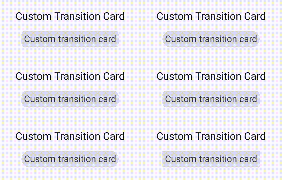
fun CustomTransitionCard(
expanded: Boolean,
modifier: Modifier = Modifier,
content: @Composable () -> Unit
) {
val transition = updateTransition(
targetState = expanded,
label = "card_transition"
)
val cardElevation by transition.animateDp(
label = "elevation",
targetValueByState = { isExpanded: Boolean ->
if (isExpanded) 8.dp else 2.dp
}
)
val cardRoundedCorners by transition.animateDp(
label = "corner_radius",
targetValueByState = { isExpanded: Boolean ->
if (isExpanded) 0.dp else 16.dp
}
)
Card(
modifier = modifier,
elevation = CardDefaults.cardElevation(defaultElevation = cardElevation),
shape = RoundedCornerShape(cardRoundedCorners)
) {
content()
}
}
|

When implementing custom animations, keep these best practices in mind:
1. Animation State Management
Keep animation state close to where it’s used:
 1
 2
 3
 4
 5
 6
 7
 8
 9
10
11
| @Composable
fun OptimizedAnimation() {
// ❌ Don't store animation values at composable level
// var scale by remember { mutableStateOf(1f) }
// ✅ Use AnimationState or animate* APIs
val scale by animateFloatAsState(
targetValue = 1f,
label = "scale"
)
}
|
- Use
remember for expensive calculations - Avoid animating layout parameters when possible
- Consider using
LaunchedEffect for complex animations
Conclusion
Custom animations and transitions in Jetpack Compose provide powerful tools for creating engaging user experiences. By understanding the core concepts and following best practices, you can create smooth, performant animations that enhance your app’s user interface.
Remember to:
- Start with simple animations and gradually add complexity
- Test animations on different devices and screen sizes
- Consider accessibility implications
- Monitor performance impact
- Use animation principles to create meaningful transitions
For more advanced topics, check out our other articles on Compose performance optimization and state management.
You can find all the examples from this post in this GitHub repository: ComposeAnimations


